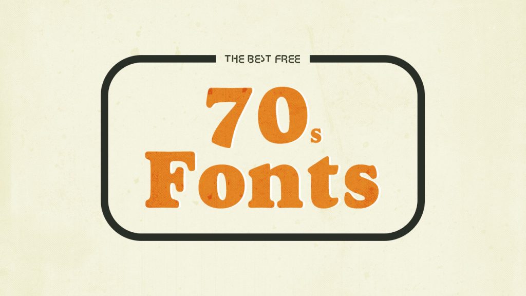
The 1970s were a time of great change. The world was slowly adapting to the digital age, and 70s fonts were no exception. While some fonts from the era have been forgotten, others have become timeless classics. In this blog post, we will explore some of the forgotten 70s fonts that are still instantly recognizable. From funky disco-inspired fonts to more traditional serifs, these fonts prove that the past can still be relevant today. So whether you’re looking for a blast from the past or just want to add a little retro flair to your design, be sure to check out these forgotten 70s fonts.
Avant Garde
Avant-garde fonts are those that push the boundaries of what is considered conventional or acceptable. They are often experimental, and may be seen as unorthodox or even bizarre. Avant-garde fonts can be great for creating an impactful or eye-catching design, but they should be used sparingly and with caution, as they can easily appear overwhelming or confusing. Some well-known examples of avant-garde fonts include Futura, Dada, and Bauhaus.
Bauhaus
Bauhaus was a German art school that operated from 1919 to 1933. The school is notable for its approach to design, which emphasized functionality and simplicity. Bauhaus fonts are characterized by clean lines and geometric shapes. Many of these fonts are still in use today, and they remain instantly recognizable.
Cooper Black
Some fonts are just timeless. They manage to remain relevant and instantly recognizable, even decades after they were first designed. Cooper Black is one of those fonts.
Designed in 1922 by Oswald Bruce Cooper, Cooper Black was originally intended for use in headline settings. Its heavy weight and rounded letters make it highly readable from a distance, which makes it perfect for use in advertising and signage.
Despite its vintage origins, Cooper Black has remained popular throughout the years. It was used extensively during the psychedelic era of the late 1960s and early 1970s, and more recently, it has been embraced by the hipster set.
There is something about Cooper Black that just oozes retro cool. If you’re looking for a font that will give your designs a vintage feel, Cooper Black is definitely worth considering.
Futura
1. Futura:
Designed by Paul Renner in 1927, Futura is a sans serif font that remains popular to this day. Its clean, geometric lines give it a modern look that has made it a popular choice for both web and print design.
Helvetica
If you’ve ever been to a design museum, you’ve probably seen Helvetica. It’s an incredibly popular typeface that has been used by some of the world’s most famous brands, including Apple, BMW, and American Apparel.
Helvetica was first released in 1957 by the Swiss type foundry Linotype. It was designed by Swiss typeface designer Max Miedinger, and named after the Latin word for Switzerland (Helvetia).
The original Helvetica design was incredibly versatile and easy to read, making it perfect for use in both body text and headlines. Over the years, it has been tweaked and updated to keep up with changing tastes, but the basic structure remains the same.
Today, Helvetica is still one of the most popular typefaces in use. If you’re looking for a classic, clean, and modern typeface, it’s a great option.
ITC Avant Garde Gothic
1. ITC Avant Garde Gothic
ITC Avant Garde Gothic is a typeface that was designed in the 1970s by Herb Lubalin and Tom Carnase. It is perhaps best known for its use in the logos of magazines such as Rolling Stone and Time. The font has a very distinctive look which makes it instantly recognizable.
2. Helvetica
Helvetica is another popular typeface that was designed in the 1950s. It is used extensively in branding and advertising, and has become one of the most widely used fonts in the world. Helvetica is also available in a wide range of weights and styles, making it extremely versatile.
3. Futura
Futura is a classic sans-serif typeface that was designed in the 1920s by Paul Renner. It remains popular to this day thanks to its simple, yet elegant design. Futura is often used for headlines and other short pieces of text where its clean lines can be appreciated.
Conclusion
We hope you enjoyed this trip down memory lane of some of the most iconic fonts from the 1970s. While these fonts may be forgotten by some, they are still instantly recognizable to many. What’s your favorite font from the 1970s? Let us know in the comments below!